

2020 was a big year for campaigns and campaign websites. With COVID-19 hitting campaigns right at the start of the cycle, many candidates realized online was where they were going to win or lose their elections. It was a huge election year, with President, Senate, and much of the 519,682 elected positions in the US up for reelection in this behemoth of an election year.
That means there was a lot of competition for websites in 2020, giving us some of the best designed, most innovative websites we've seen. Last year we highlighted some of the best political campaign websites of 2019, but the competition in 2020 was much more fierce.
Here at PoliEngine we're always keeping our eye out for the newest trends and exciting ideas coming out of the political website space to make sure our platform continues to be the leader in political website design. After going through thousands of websites, these are the ones that stood out to us, and we hope will inspire you as you build your political websites in 2021 and beyond.
Dr. Al Gross for Alaska Senate

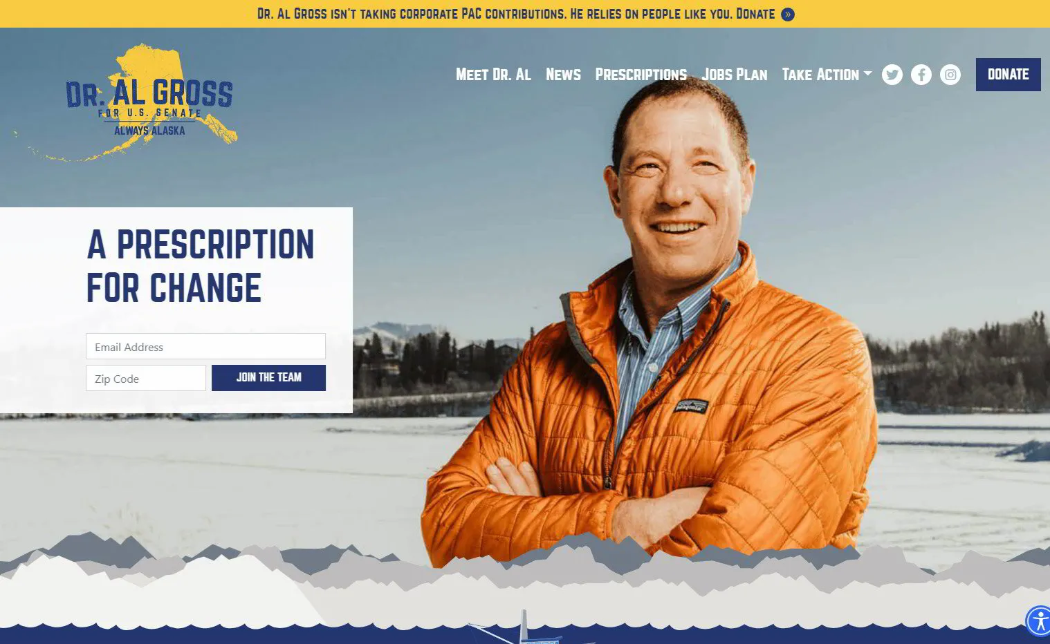
Now THIS is a campaign website, maybe the best we've come across. Dr. Al Gross was the Democrat running for United States Senate in Alaska, and while he lost his race in ruby red Alaska, his website was by far the best of the year. It’s a marriage of innovation, campaign focus, and beautiful execution.
Dr. Al Gross’s website launches with an instagram-y filtered image of him standing in front of Alaska’s stunning mountains. Scrolling down you can see the two main motifs that repeat throughout the campaign website: the mountains and the ocean. The mountains animate in a pagination as you scroll, collapsing into an ocean beneath. In the ocean sits a cool, animated fishing boat sitting on top of a typical candidate statement. It gets the point across immediately as to what this candidate is about how they want to be perceived, without having to say it outright.
These motifs fit into Dr. Al Gross’s main points from his bio the campaign wanted to emphasize: that he’s a doctor and fisherman who has come from a long family of well-known ocean conservationists.
Scroll down through the welcoming, pure white background punctuated by dark blue. The dark blue directs your eyes where the designer wants you to focus: headings, donation buttons, news, and updates. The text size is BIG and BOLD, 80px font of a little-used san-serif font called Norwester, giving the site an eccentric but still professional look.
Everything about this site is top-notch, with little details like naming his “Issues” as “Prescriptions”, highlighting the fact that he’s a doctor. It also goes in on using negative space, giving it a very Alaska feel of wide-open spaces. It's an incredible campaign website that deserve all the kudos you can heap on it.
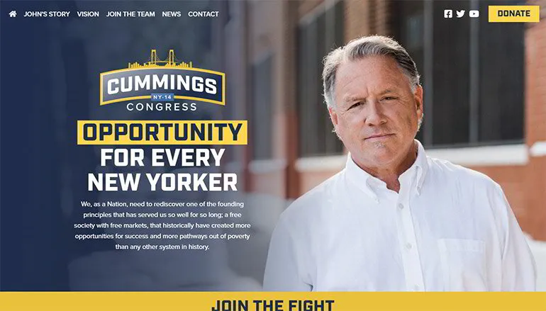
If you’ve never heard of John Cummings you almost certainly heard of his opponent: representative Alexandria Ocasio-Cortez. Running against an incumbent is hard, running against one of the most famous politicians in America is a herculean task.
As you could imagine in this deep blue district, John Cummings ended up losing by 38%. However, AOC’s remarkable national profile and role as bogeyman #1 of conservative news made this the 2nd most expensive house race in the United States. This allowed John Cummings, who would normally have been cast into obscurity, to build a pretty incredible campaign, with messaging that seemed right on point and a website that reinforced that core messaging.
John Cummings sought to weaponize AOC’s strong national profile into a weakness, by painting her as an out of touch politician more interested in making a national name for herself while neglecting her local constituency. Cummings, by comparison, tried to paint himself as Mr. New York City, a down to earth guy you could grab a beer with.
This was not, of course, enough to win, but the campaign website is a master melding of campaign messaging to website design. It kicks off with his messaging: “Opportunity for Every New Yorker” before jumping down to a personal letter with a beautifully designed background video. Background videos like this were all the rage in 2020, and John Cummings team uses it throughout the campaign website to great effect throughout while not overshadowing what they're trying to say. These videos aren't difficult to do, you can even set one up on your PoliEngine website easily, but they're very easy to overdue and be too flashy. Cummings design team were restrained and classy in their execution.
These videos were used, like most of the design choices, to humanize the candidate and make him feel more real. There are a lot of quality photos of him talking with constituents, and well crafted personal statements throughout. We also love the design of the "Issues" page, with its subtle and classy animations.
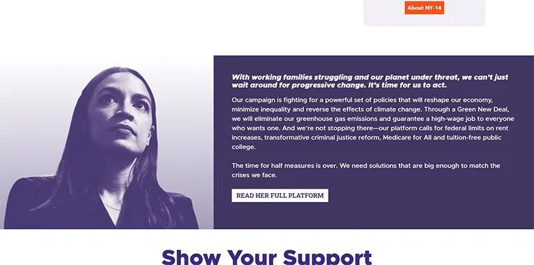
Speaking of AOC, her design work has always been top-notch. From the intriguing logo she created, to her unique typeface, her designs have inspired legions of copycats. AOC and her team are famously digitally savvy, and 2020 is no exception to the innovation they've been known for.
Unlike her opponent's campaign site, which sought to make him relatable and down to earth, AOC is going for larger than life and iconic in her look. Her campaign website uses a beautiful duotone design for all her images, putting her in a high contrast white and purple design. That style was very in vogue in 2020, and I think it’s just stunning for the right candidate and the right color scheme. Dark purple works very well for this style and AOC is the right candidate to do it with.
There’s not really a weak part of this political site (aside from that questionable header she kicks it off with). Her “About” page is beautifully designed with eye-catching flourishes and not a word wasted. The "Issues" page does a great job of letting people scan her main issues while also making it easy to click and learn more details.
One thing that stands out is the COVID-19 Resource Page, a website section that also became very popular in 2020, for obvious reasons, and AOC creates a great one. She has a list of webinars she put on related to COVID-19, a downloadable Toolkit, and even a sign with her branding on it that she is encouraging people to print out and put in their windows to let neighbors know that you’re there to help if they need it. They even have COVID-19 resources in 5 different languages, a nice touch for such a diverse district.
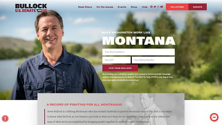
Steve Bullock didn't win his race for U.S. Senate in Montana. Like many on this list he was a heavy underdog, but perhaps because of that worked twice as hard as his opponent to make a website that would dazzle.
The site as a whole is beautifully laid out, with a welcoming white background design scheme interspersed with a classy crimson-red color scheme. The animations are very tastefully done, adding interest without overshadowing the rest of the site.
However, there were a lot of great, tastefully done websites in 2020 (many built right here on PoliEngine). Steve Bullock's gets on this list for a couple of very cool innovations he did on his website that we've never seen before and were executed beautifully.
The first is the "Share Your Story" app which allows supporters to record themselves talking about why they support Steve Bullock and upload it directly to the website. You simply click a button, a popup comes and asks to use your camera, and you record yourself giving a testimonial about Gov. Bullock. The process is fast, simple, and a great way to engage voters in a time of COVID-19. The app was created and hosted by the folks at Countable, and I'm sure we'll see more of this in the years ahead.
The second is this cool interactive map that highlights what Steve Bullock has done for each county as governor. You have a jumble of icons on this map that you can select and learn more about what he's done for your local area. It's completely organizable by county and topic, or to just scroll through the map and see everything all around. It's a cool setup that's worth diving into more on his website.
Joe Biden for President
We really didn’t want to focus on the presidential campaigns for this article. Presidential politics already took up way too much oxygen in 2020, and most people have likely already been to one of the two candidates' websites. But you can't deny the incredible amount of thought and labor that goes into designing presidential-level campaign websites. Unlike most campaign websites, there's a whole team behind these sites constantly updating them and evolving them as the campaign moves.
The way these campaign websites are treated is another league from how most are, and Joe Biden's website is a great example of that. The front page is a traditional, duotone structure with a white background on a boxed website layout. This is pretty typical for a campaign website, and for good reason: it’s clean and easy on the eyes.
But it's everything behind the front page that makes this website worth a deep dive. From the immaculately crafted campaign store, to the constantly updated asks on their front page.
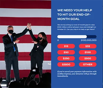
Campaigns generally don't update their websites with time-bound, end of month donation asks. They reserve those for their digital and email fundraising and the campaign website serves as a "set it and forget it". Not Joe Biden's site, which used best practices for donations by constantly updating their site.
The whole site is a masterclass in understated, quality design principles, but there are a few highlights of innovation that you should take notice of:
Joe’s Story (his "About" page) takes us through Joe Biden’s life, from his “humble beginnings”, to his unlikely win for US Senate at 29, to losing his family in a car accident, to becoming Vice President. As you scroll through and read you're followed by an animated train, the same kind of train that the bio explains, he took to get to Washington D.C. everyday from Wilmington.
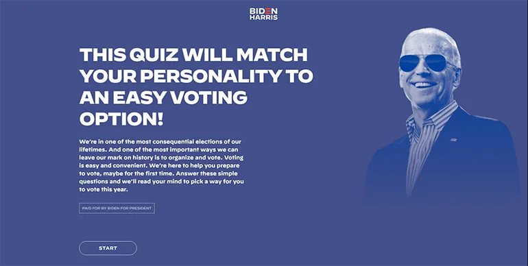
Or this cute voting personality quiz, giving voters a Buzzfeed like quiz about politics and spitting out how they should vote in 2020.
A more practical takeaway for most campaigns is how they choose to update their site. They used the campaign website to get information out to help fight narratives or create their own. For instance: when Trump was attacking Biden for not doing enough on COVID-19, the website team quietly put up a webpage showing a plan and a timeline of everything Biden had done to combat COVID-19.
We're not saying it's the most daring nor innovative site of 2020, but it's a fine match for the traditional candidate it was promoting, a candidate who's main pitch was "let's get back to boring politics again", and the website does a great job of doing that while keeping it interesting.
Rick Blangiardi for Honolulu Mayor
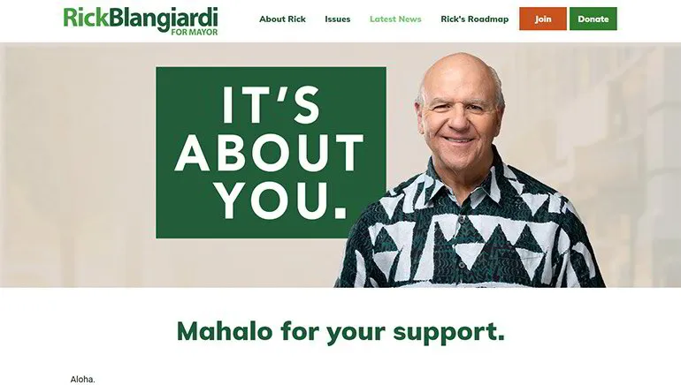
Rick Blangiardi's campaign website isn't the most flashy website of 2020, but it sure feels right for the mayor of a Hawaiian city. With a very organic green and light-brown color scheme, punctuated by sincere, straightforward sections about the issues he cares about, it feels just fits.
We're all fans of the downloadable "Roadmap to Recovery", the simple "Meet Rick" slide deck, and the "Women for Rick" section. The "Issues" page is beautifully understated and to the point, with a photo of him about to talk to the camera, as though he'd just telling you his issues right there on the page.
It all around feels very approachable and down to earth, the kind of thing most people want from their mayor, but especially a laid back, oceanside city like Honolulu. It's very well executed and sincere, and should make great inspiration for anyone looking at building a site like this.
How do I design political sites like these?
You can dish upwards of $50,000 on a political website development company, like many of these did, or you can sign up for PoliEngine.com and take your design into your own hands with all of the same capabilities, but at a fraction of the cost. For just just $29 per month you get beautifully designed templates, powerful marketing tools, easy integrations, and a lot more.
Sound too good to be true? We get it, but to prove it we offer a free trial so you can see for yourself how easy, and powerful, PoliEngine can be.